1. Founded in 1989 (initially, as a subdivision of ParaGraph International), Paratype is the oldest and one of the biggest Russian
font distributors. The company was founded by the former employees of Poligraphmash’s Type Department (USSR’s only type design
bureau) and for many years was effectively the monopolist on the Cyrillic type market.
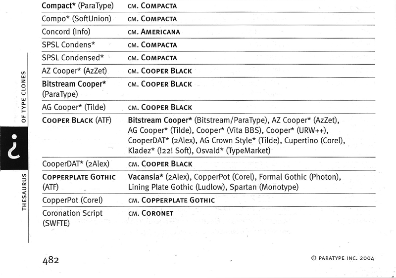
The specimen book of Paratype1 typefoundry, which was published in 2004, has an interesting addendum in the end — the Thesaurus of
Type Clones. Set in two columns, it lists 'prototype' typefaces in bold small caps, typefaces distributed by Paratype in bold, and the all the
other fonts in regular (typefaces with Cyrillic characters are marked with an asterisk). This little dictionary is a curious artifact of early
digital Cyrillic typography, an era of bootleg copies of Western typefaces and nonsensical font names. The Thesaurus is designed to navigate
the customer, who seeks to find Cyrillic substitutes for Western fonts, into the safe harbor of typefaces distributed by Paratype and away
from the low-quality copyright-infringing alternatives by other producers. At the time of its publication it was perceived as a useful tool
(how would you otherwise find out, that Cyrillic version of Helvetica Rounded is called Rotonda?), but a tool born out of the misery of Cyrillic
typographic life, a tool that you would never need in the perfectly organised world of Latin typography.
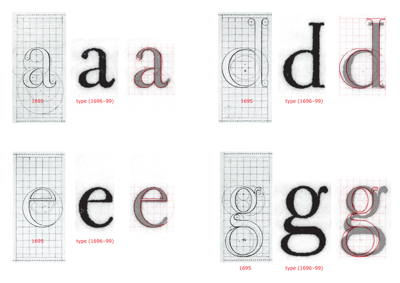
2. In 1641, 80 years after Garamond’s death, Imprimerie Royale (French Royal Printing Office) acquired typefaces from Jean Jannon,
which later were misattributed to Claude Garamond. A lot of Garamond revivals from the beginning of 20th century were based on the specimens of these typefaces,
and only in 1926 an article by Beatrice Warde, published in the British typography journal The Fleuron, revealed that the
Imprimerie Royale (at that time already Imprimerie Nationale) typefaces were in fact the work of Jean Jannon. Beatrice published her discovery
under the pen name «Paul Beajon», who as the result of this publication was offered a part-time position of editor of
the Monotype Recorder. A position which Warde accepted to the astonishment of Lanston Monotype Corporation executives in London, who were
expecting a man.
3. Robert Granjon
(1513, Paris — 1589, Rome)
French type designer, publisher and printer. His italic typefaces were often used as the
source for italic styles of Garamond revivals.
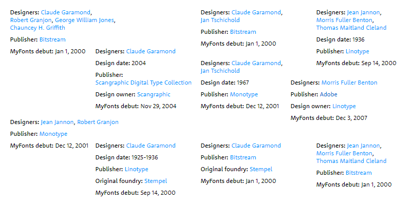
Truth is, in the much more perplexed world of Latin typography such tool is simply unimaginable — a single entry on Garamond would be longer
than the whole of Paratype’s specimen. Let’s try to imagine — Linotype alone has at least seven: STEMPEL GARAMOND (a digital version of Stempel’s
revival from 1925), GARAMOND №3 (based on Morris Fuller Benton’s non-Garamond revival2 from 1917), GRANJON (based on a 1928 typeface
by George William Jones, which was given Granjon’s name3 for the sole reason to not publish another typeface named «Garamond»),
SIMONCINI GARAMOND (based on Francesco Simoncini’s revival from 1961), GARAMOND CLASSICO (which is again a Jannon and not a Garamond),
SABON (based on the typeface designed in 1967 by Jan Tschichold himself) and SABON NEXT (a revival of Tschichold’s revival, designed
in 2002 by Jean François Porchez).
Now, let’s cross-reference Bitstream library with Linotype: ORIGINAL GARAMOND is STEMPEL GARAMOND, CLASSICAL GARAMOND is SABON (and not
GARAMOND CLASSICO, as one might have expected), ELEGANT GARAMOND is GRANJON, ITALIAN GARAMOND is SIMONCINI GARAMOND and AMERICAN GARAMOND is
GARAMOND №3.
By the way, calling a typeface «American Garamond» is as ambitious, as it is misleading, since there is a great number of other Garamonds
with American roots: ATF GARAMOND (which is yet another version of Benton’s revival); LTC GARAMONT (based on Frederic Goudy’s design
for Lanston Type Company), LUDLOW GARAMOND and GARAMOND FB (both based on 1929 revival by R.H. Middleton for Ludlow company) and, of course,
the most American of all American Garamonds — the (in)famous ITC GARAMOND, designed in 1975 by Tony Stan.
The most distinctive element of the typeface is its enormous lowercase x-height. In theory
this improves its legibilty, but only in the same way that dog poop’s creamy consistency in
theory should make it more edible.
Michael Bierut,
I Hate ITC Garamond, 2004
Perhaps, numerous bootleg copies of ITC Garamond should also be included in our imaginary dictionary: from a typeface with
a confusing name CLASSIC RUSSIAN, which has no traces of authorship, to pirate copies of APPLE GARAMOND, which copyright
metadata reads «Copyright 1991 as an unpublished work by Bitstream Inc. All rights reserved. Confidential.» Remarkable German
company SoftMaker, which offers a package of 7 444 typefaces for 300 dollars, has a very similar to ITC Garamond GARAMOND
NOVA PRO. And there is another Garamond to be found in their package — GARAMOND SERIAL — which should be filed with other
Simoncini’s Garamonds: GARAMOND SIMONCINI by Scangraphic, GARAMOND SIMONCINI EF by Elsner+Flake, and the abovementioned
ITALIAN GARAMOND by Bitstream and SIMONCINI GARAMOND by Linotype.
There also must be made a special section for the Garamonds that imitate the appearance of old print: 1530 GARAMOND by Tiro
Typeworks, ARCHIVE GARAMOND by Archive Type, 1592 GLC GARAMOND and 1689 GLC GARAMOND by Gilles le Corre, and even
a typeface with digital distorions added to initially smooth outlines — EF GARAMOND ROUGH by Elsner+Flake.
Now, things get much more complicated and hard to remember when it comes to Garamonds with numbers instead of proper names:
Scangraphic has GARAMOND, GARAMOND №1 and GARAMOND №2. Scangrpahic’s GARAMOND seems to be identical to GARAMOND №2
by URW++ and URW GARAMOND is identical to Scangraphic’s GARAMOND №2 (which is also a copy of BERTHOLD GARAMOND, but
let’s try not to divert too much). URW’s GARAMOND №4 (third one seems nowhere to be found — maybe to avoid confusion with Linotype’s
GARAMOND №3) is similar to GARAMOND №5 by Elsner+Flake. And, finally, GARAMOND №9 by URW (numbers fifth to eighth are, again, missing)
is yet another Simoncini Garamond.
This list might be continued on and on: there are two more Garamonds by Monotype (MONOTYPE GARAMOND and MONOTYPE SABON) and
two Garamonds by Adobe (ADOBE GARAMOND PRO and GARAMOND PREMIER PRO),
another Garamond by URW (AMSTERDAMER GARAMONT), Swedish TYMA GARAMOND, two Garamonds by DTP Types (GARAMOND DT and GARAMOND 96 DT),
thick and clumsy TS GARAMOND by TypeShop Collection, GARAMOND ANTIQUA PRO by Ralph Unger, and so on, and so forth...
But let us stop at the 47 Garamond mark.
Claude Garamond designing in 2004, digital typefaces from 1936 and other curiosities.
It is surprising how rarely the authors of digital versions of all these Garamonds are credited. It gives
a feeling that the translation of, for example, Benton’s metal typeface to Bezier curves is a mundane, almost purely mechanical task.
In fact, the opposite is true: an adaptation of 16th century Garamond for the early 20th century printing machinery might be
considered a task of mere conversion of an old typeface for the new specifications, while the translation of any
metal typeface to a digital one (which can be: pixelated on screen, diffused by inkjet printer, milled out of wood two meters tall,
lasercut on a tiny polymer stamp, printed with the coarse silkscreen mesh or with the 2400dpi offset) is a much more complex and
ambiguous job.
First of all, what metal type size should be taken as the source for the new revival?
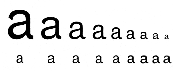
Even with the widespread use of pantograph, metal typefaces of the same name by the same foundry have a very different
appearance in different sizes.
Image by Klim Type Foundry
Next, how do you convert the imprint to outline: should the ink spread become part of the new outlines as an integral part of the
design or should the contours be made sharp and closer to the (assumed) intentions of the ancient author, who was merely
hindered by the technology of the day?
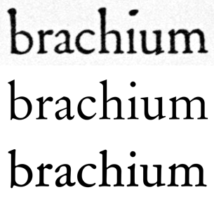
Garamond imprint compared to the modern revivals: Original Garamond (middle) and ATF Garamond (bottom).
4. Romain du Roi is a typeface designed on commission by Louis XIV by the Bignon Committee, which was set up in the
newly created Academy of Sciences with the goal to compose the compendium of all trades and professions. The Commitee started its
survey with typography as 'the art by which all others are preserved'. Their creation,
Romain du Roi, was arguably the first example of rational type design, a typeface that was not developed by the hands
of punch cutters, but constructed on a grid by compasses and rulers, ignoring calligraphic models in favour of
analytical and mathematical principles. However, Philippe Grandjean, who cut the punches for the metal type, took a lot of
liberties to moderate the cold geometry of the original lettershapes, and the appearance of Romain du Roi in print is
rather different from its original design.
And even if you are lucky enough to acquire the original drawings of the prototypeface, it is still often unclear how to
translate them, as the difference between what was designed and what was casted in metal might be vast.
Romain du Roi4 is a particularly evident example of such discrepancy.
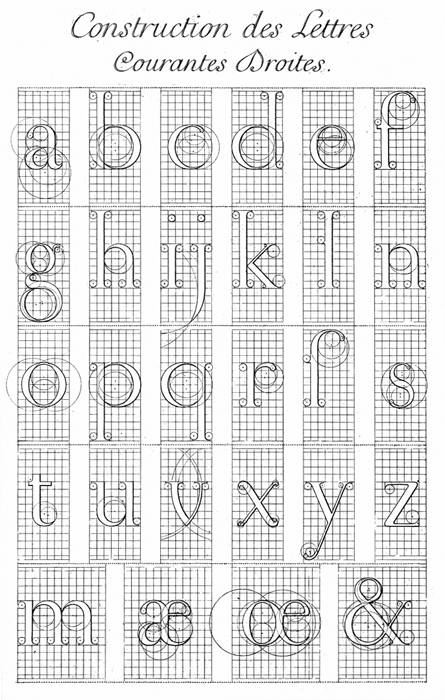
One of the engraved plates, showing the construction of lowercase Romain du Roi.
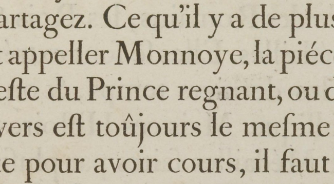
Romain du Roi as it appears in print.
The original design compared to the imprints of the typeface.
Image from Riccardo Olocco’s «Romain du Roi. The surviving plates», 2013
It might well be that this confusion, that the mismatch between designed and printed Romains du Roi causes, is the reason why
the typeface has only a few revivals, despite its unprecedentally well-preserved design documentation.
Gothic typefaces of the early 20th century (especially the American ones) present a particularly interesting case when it comes to
the translation of crude old imprints to highly precise digital outlines. The irregularities and inconsistencies of these typefaces,
emphasized by their simplistic lettershapes, make all the design (and production) flaws an integral part of their handdrawn appearance.
An appearance, which disappears if the typeface is reproduced with the fidelity of modern type design software.
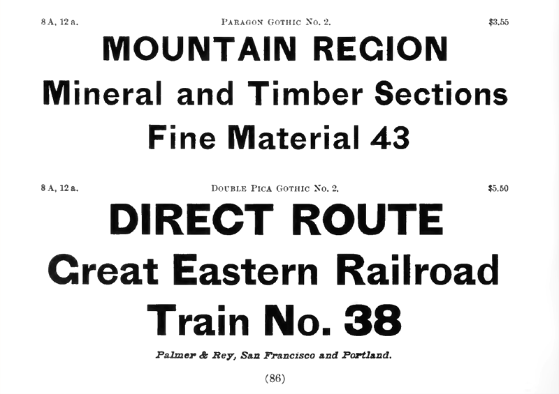
Palmer and Rey’s specimen, 1887
Barnhart Bros. and Spindler’s specimen, 1907
Miller and Richard’s specimen, 1921
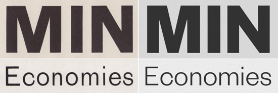
Most of the modern revival projects tend to either 'correct' the inconsistencies of the old typefaces in
order to achieve high quality smooth typesetting...
Image: Founders Grotesk by Klim Type Foundry
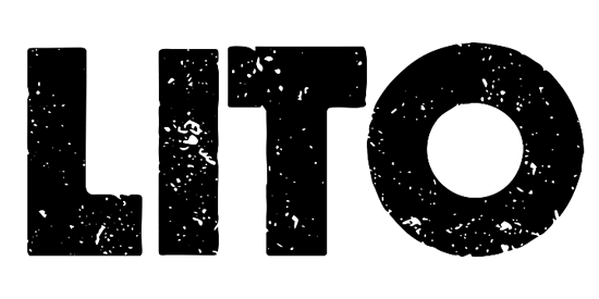
... or make a fetish out of the old print appearance.
Image: Lito by Borutta Group
The new typeface — Steinbeck — is an attempt to catch the feeling of these numerous Gothic typefaces not by applying digital special effects, that simulate
the inconsistencies of print, but by approaching the process of drawing the Bezier curves differently.
Drawing outlines in a computer vector program, it is too easy to rely on the measurement tool rather than on one’s eye.
Too easy to make everything geometrically perfect and visually boring. It is almost irresistable to correct a humpy curve, uneven
width, imperfect symmetry, an inconsistent thickness — ideal smoothness is just one mouse drag away. In Steinbeck many of the occuring
inconsistencies were kept (and many were made intentionally): without fanatically collecting curious deviations, but rather with
a healthy disregard for digital precision tools.
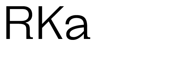
In some letters the top parts overhang the bottom.
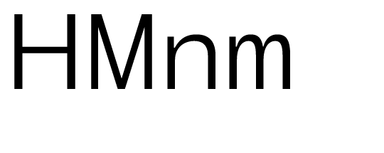
Some letters are drawn narrower than the others.
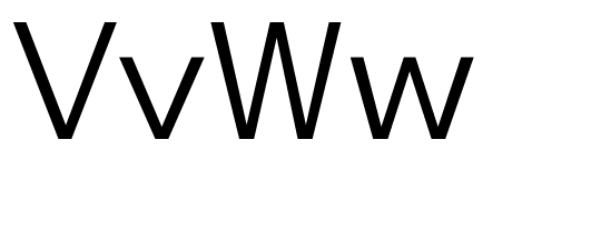
The symmetry is often imperfect.
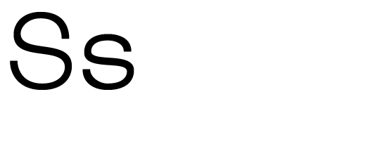
And some letters just have erratic contours in general.
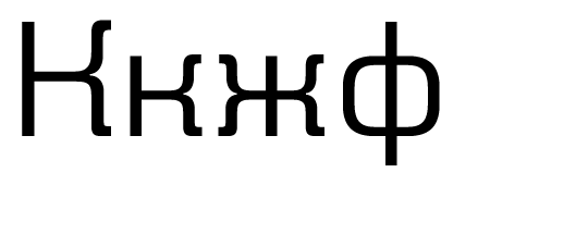
Cyrillic lettershapes were largely influenced by Rublenaya, Russian version of Akzidenz Grotesk from the beginning of the 20th century.
The influence is especially apparent in the shapes of к, ж and ф.
Some italic shapes of Steinbeck are borrowed from Emma Zakharova’s designs. In 1987 she developed an interesting italic style
for Bukvarnaya (a Soviet sans serif for kids): many characters of her italic were based on handwritten shapes rather than
the usual slanted or cursive ones.
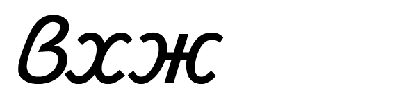
The most notable letters being, probably, lowercase в, х and ж. Unfortunately, the italic styles of the original digital version of Bukvarnaya —
TextBook by Paratype — have very crooked outlines and poor spacing, and the revised version of the typeface — TextBook New from 2007 — abandoned
Zakharova’s designs in favor of the usual slanted shapes.
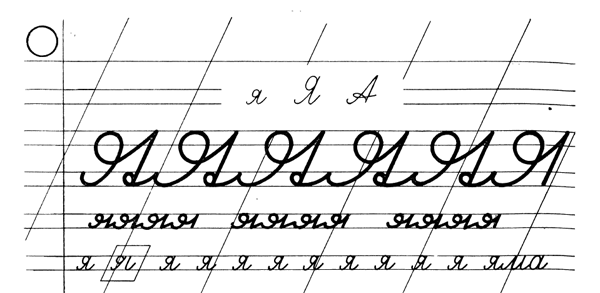
A typically handwritten shape of я was used in Steinbeck Italic in addition to Zakharova’s shapes of в, х and ж.
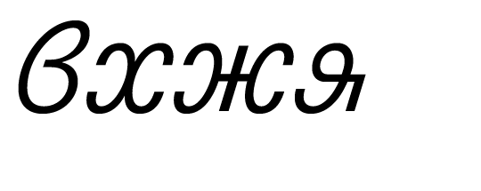
Cyrillic в and х are also used as Latin b and x.
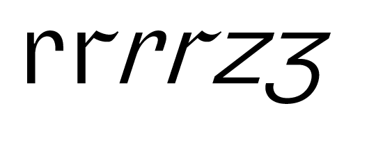
The typeface features an alternative shape for r and, in italic, for z.
The resulting typeface produces irregular and uneven, but (most important) lively typesetting.
As of today, two styles — Regular and Italic — are
released,
but the plans are made to expand the family (above all, with bold and condensed cuts).
Roman Gornitsky,
The Temporary State
14.05.2018