In late 2018 I was asked to design a custom typeface for Experimental Jetset’s new visual identity of V-A-C Foundation (Moscow/Venice). A paradoxical assignment — to make a new typeface for the design studio, which by popular belief always uses the same one.
There is a big difference between what Helvetica is famous for and what it really is. To put it in a very simplified manner, Helvetica is known to look like this:
While actually it looks like this:
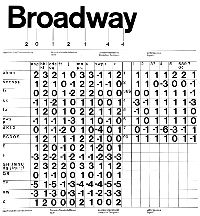
One might consider it to be an insignificant difference — the top example just has a tighter spacing, that’s all — but this minor difference becomes a big difference the moment you try to set the type. While Helvetica enjoys a reputation of the typeface that miraculously generates design by itself — you just set a random word in Helvetica and it becomes a slick Modernist logo — in practice it requires meticulous arrangement and lots of tedious manual adjustments.
The fact that Helvetica on the example above is, in fact, Akzidenz-Grotesk makes no conceptual difference —
Helvetica’s kerning table would be just as big.
To suggest that the way we use Helvetica is an easy way out typographically is ridiculous. We spend an enormous amount of time spacing, kerning, lining and positioning type. The fact that we use only a small variety of typefaces demands a certain discipline, a skillful precision, a focus on the finer details. It’s certainly not that a-different-typeface-for-every-occasion attitude. Now, that would be an easy way out.
Experimental Jetset,
2003
1. As opposed to Univers, which is a true text typeface — and therefore you can never find Univers in tight display arrangements.
The truth is: Helvetica is actually a display font. It works best in large sizes, carefully (and playfully!) manually composed1. It’s a display typeface which is deeply ashamed to admit it. In fact, calling it a display font almost feels like an insult: its dry and rational lettershapes seem to objects any idea of decorativity and the history of its use imply the supremacy of mechanistic grid layout over any sort of manual compositions. Therefore it pretends to be a text typeface and consequently all the helveticoids feature rather loose, typically text letterspacing. Surprisingly, there seems to be no typeface yet, which would follow a seemingly obvious idea: «Good Helvetica is tight Helvetica».
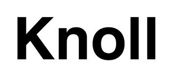
Even the Display styles of the latest Helvetica release — Helvetica Now — are set rather loose:
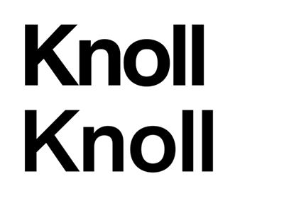
Top: Knoll logo
Bottom: Helvetica Now Display Bold
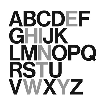
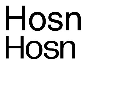
There is yet another dimension of the Modernist typographic tightness — a vertical one. Helvetica is supposed to not only be set tightly in a line, but those lines themselves should also be assembled tightly:
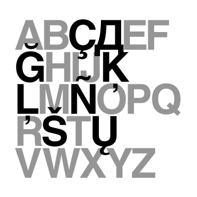
Which is not a problem as long as you set your text in English (or Dutch). But if you have to use Latvian, Spanish, French, Russian or almost any other alphabet, you are up for a challenge:
This gives us another starting point: in a properly international Modernist typeface ascenders, descenders and especially diacritics should be extremely short. Seemingly a minor detail, it changes quite a lot. Once you make the ascenders and descenders short, you have to compensate it by making the typeface wider. And if you make the typeface wider, you have to introduce more contrast to the characters...
Top: Helvetica
Bottom: Gramatika
2. While the correct spelling in Russian would be «Grammatika» — with double m — «Gramatika» is spelled with only one m in every other Slavic language: Belarusian, Bulgarian, Croatian, Czech, Macedonian, Polish, Serbian, Slovak, Ukranian... Therefore, in a spirit of Modernist cosmopolitanism, the more Interslavic spelling was chosen.
As usual, all sorts of minor considerations lead to one another and accumulate rather quickly (in the end causing a major overhaul of the entire typographic ecosystem), and in case of
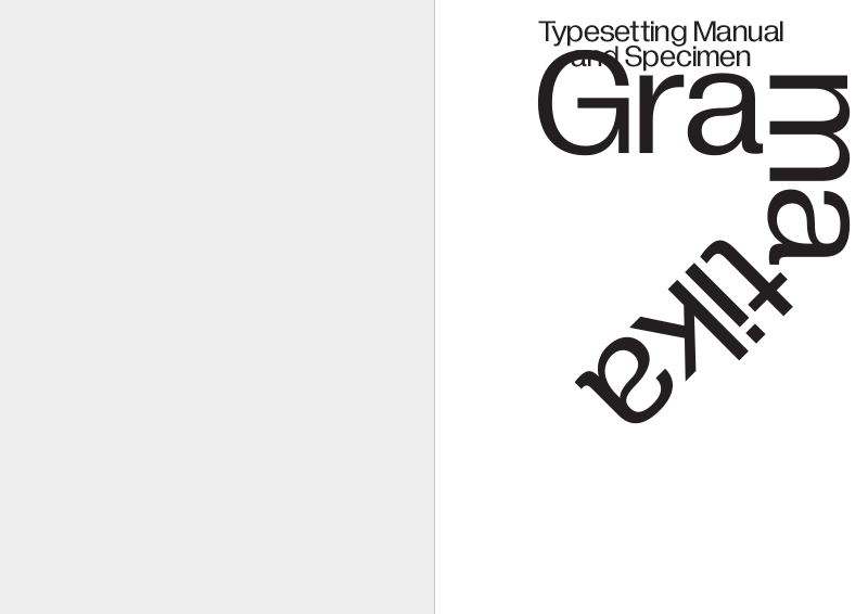
Gramatika2 there are just too many of them to fit in a single article, so a special manual was composed, which combines the development theories with some practical notes on how to set the new typeface:
You can order a printed version of the manual
here (A4 format, 48 pages, staple bound), or download it as a PDF
here. And in case you don’t have time to read through it, here’s a very brief overview of the content:
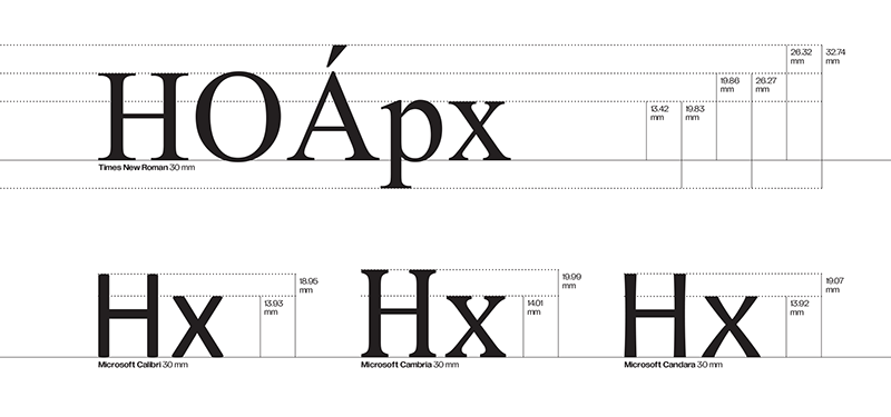
When you start to consider the line height, you quickly realize that the entire type measurement system doesn’t make any sense. 30 mm of Times New Roman have nothing to do with the actual 30 mm and, even worse, every typeface has it’s own set of metrics:
In a futile attempt to bring order to the vertical metrics, Gramatika offers a radical solution: 500 units x-height (half the font size) for everyone!
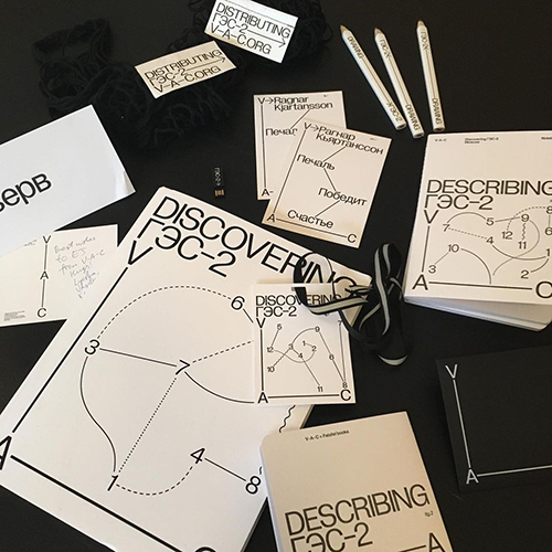
Various V-A-C Foundation printed matter.
Photo by Experimental Jetset.
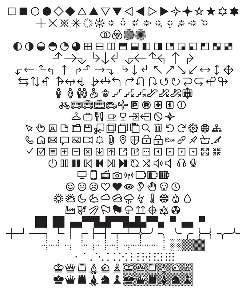
The «diagrammatic language» developed by Experimental Jetset for the V-A-C identity implies, as the name suggests, a wide use of all sorts of graphs, diagrams and schematics. Which demands the typeface to include at least a minimal selection of arrows, icons and geometric shapes. This minimal selection of the initial V-A-C typeface grew almost out of control in Gramatika, now featuring 325 additional symbols and pictograms (not including the alphabetic characters, punctuation marks and math symbols):
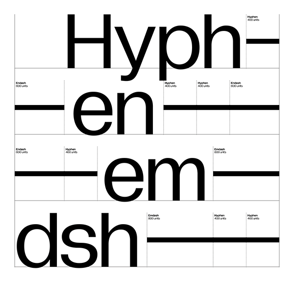
There’s hardly any topic in typography that enjoys as much attention as «which dashes should you use where» (with the only close contender being «the art of the correct quotation marks»). Contemplations on the possibility of dash simplification led to a curious (and, probably, controversial) result in Gramatika — a stackable spacingless hyphen:
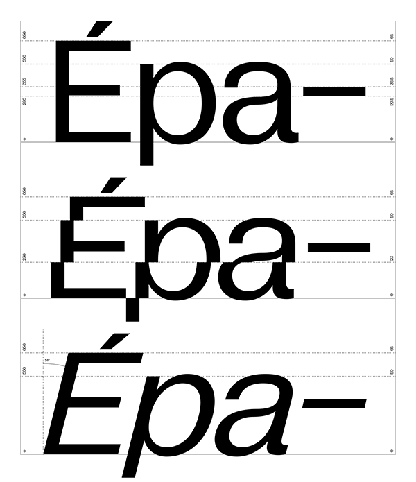
Apart from the usual in Modernist sans-serifs oblique style, there is an alternative "italic" in Gramatika: the rigid vertical structure of the typeface gave birth to the idea of creating a slant by slicing the letters horizontally and shifting these cutoffs along the x-axis:
I would like to thank Marieke, Erwin, Danny, Lyosha and all the others involved in the development process.
While Gramatika is (almost entirely) based on the typeface developed for the visual identity of V-A-C Foundation, there is a number of crucial differences between the two (in character set, family composition and even shapes of some characters).
Roman Gornitsky,
The Temporary State
23.11.2020