Latin alphabet is not very suitable for monospace typesetting. Trying to force «I» and «W» to occupy the same amount of space without making them look completely disfigured is not an easy task. Nevertheless, the monospace Latin fonts still have to be produced every now and then (at the very least, out of technical necessity), in which cases all sorts of width-saving and serif-stretching techniques are utilized to mitigate the distortions and make the characters appear as 'normal' as possible. Though, why do monospace fonts try to appear normal and satisfy the standards of propotional typography? Was there ever a monospace font that didn’t try to hide it’s stretch marks and simply existed in the aesthethic dimension of its own?
Saying that, it’s hard of course not to comply to the beauty standards of proportional typography, since almost all the Western typography is proportional typography and the beauty of a proportional typeface is the only beauty that we know. But what if we forgot about the looks altogether and tried to focus on something else instead — how about efficiency, for example? What would be the easiest and the most convenient way to adjust the width of a letter? Well, to stretch it, of course! In our digital age, there is no technique more accessible — you can stretch and condense type in almost any text editor (even in MS Word) and in almost a single click.
Of course, anyone who studied graphic design for even a week knows that stretching type is a big no-no. It’s one of the very first things that you learn: you absolultely can not stretch type, not even by one percent. Because stretching the type destroys the elaborately organised harmony of the typesetting. But in our case, destroying the delicate harmony of proportional typesetting might be exactly the thing to look for.
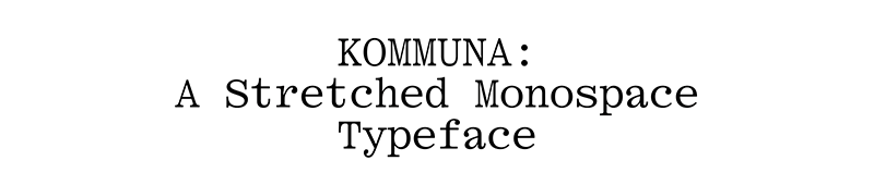
Introducing Kommuna — a truly egalitarian typeface, in which each character is forced to occupy the equal amount of space (regardless of that character’s demands and desires).
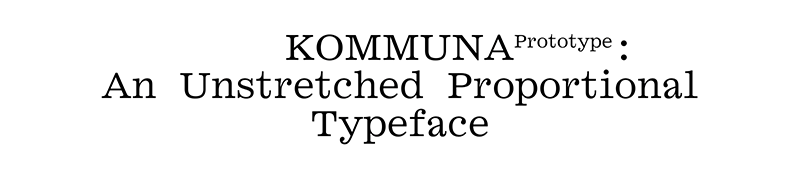
For this project, first a proportional typeface was drawn, a Clarendon-type serif heavily based on Soviet Zhurnalnaya:
Each letter of this proportional prototype was then mechanically stretched (or condensed) to achieve the uniform width:
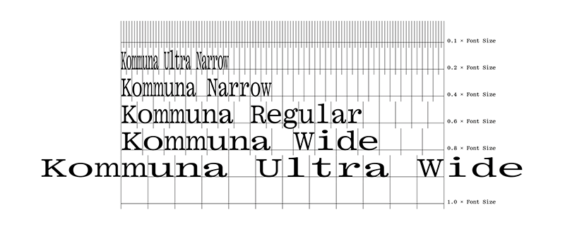
The typeface is released in five widths:
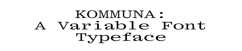
Additionally, following the latest fashion, it is also made available in Variable Font format:
The font’s dimensions are designed to be compatible with
Gramatika:

Caps height and x-height in both typefaces are the same. Hyphens, dashes and math symbols are also on the level. The ascenders and descenders in Kommuna are a bit longer.
Finally, the only OpenType Feature in the typeface is the dotted zero:
Obviously, Kommuna cannot really claim that it was conceived in the aesthethic dimension of it's own — afterall, it's just a weirdly stretched proportional font. Nevertheless, the way it appears and operates is rather alien to the conventions of proportional typography. And despite that, it still produces a rather convincingly looking typesetting — very uneven, but lively and attractive in it's own way.
Roman Gornitsky,
The Temporary State
04.10.2021